Not every UI trend belongs in every product. Learn how to evaluate design choices against user needs — and build the culture to make it stick.
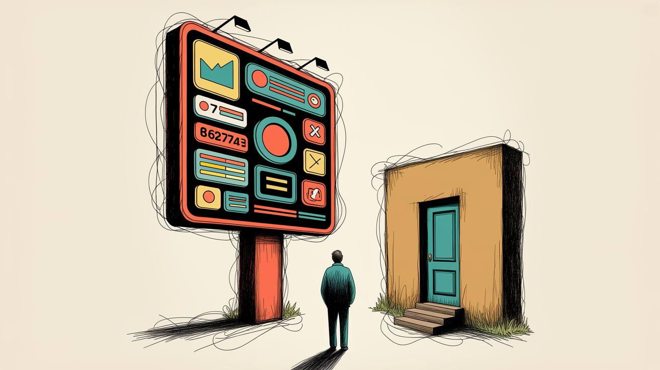
The fastest way to spot a design team under pressure is to look at their product changelog. Glassmorphism one quarter, bento grid layouts the next — not because the user needed it, but because the design director saw it on a conference slide.
Trends move fast. User psychology moves slowly. The gap between those two speeds is where UX debt accumulates.
The Trend Adoption Problem Has a Data Signature
Here’s something that doesn’t get discussed enough in design reviews: UI trend adoption is a form of uncontrolled experiment. You ship a redesign, your session duration drops 12%, and everyone assumes it’s a seasonal anomaly. It probably isn’t.
Smashing Magazine’s Kat Homan makes this tension explicit in a recent deep-dive on mental health app design. Her argument — that UI patterns optimised to capture attention actively undermine the needs of distressed users — applies far beyond the mental health vertical. The evaluation framework she proposes asks designers to assess each trend against three questions: Does this reduce cognitive load? Does this foster trust? Does this give the user a sense of stability?
Run those three questions against, say, a parallax hero section or an auto-advancing carousel, and the answers get uncomfortable quickly. For high-stakes product categories — financial services, healthcare, insurance, even e-commerce checkout flows — the cognitive cost of visual novelty is a measurable conversion killer. In Southeast Asia, where mobile-first users are frequently completing transactions on 4G connections in fragmented attention environments, that cost compounds.
Trend Evaluation Is a Data Problem, Not a Taste Problem
The reason design teams keep adopting trends that hurt their users is structural: there’s no feedback loop connecting aesthetic decisions to outcome metrics. A/B testing catches the obvious failures. It rarely catches the slow erosion of trust that happens when an interface feels unpredictable or effortful.
Building that feedback loop requires treating design decisions the way a data team treats feature flags — with a hypothesis, a measurement plan, and a defined rollback threshold before anything ships. Concretely: if you’re introducing a new interaction pattern, instrument it. Track task completion rate, error rate, and time-on-task independently of broader engagement metrics. On Shopee or Lazada-integrated storefronts, watch add-to-cart rates at the session level, segmented by new versus returning users. New users are your canary — they have no learned tolerance for your interface’s idiosyncrasies.
Homan’s framework also surfaces an important nuance for Southeast Asian markets: cultural associations with colour, animation speed, and spatial density vary significantly across the region. What reads as energetic and trustworthy in a Jakarta context may register as overwhelming or unserious in Singapore or Bangkok. Trend adoption without localisation testing isn’t just aesthetically risky — it’s commercially risky.
The Culture Problem Underneath the Design Problem
None of this analytical rigour happens without the right team conditions. UX Collective’s Kai Wong makes a point that resonates strongly here: psychological safety in design teams isn’t a leadership initiative — it’s a practice that any designer can build from their current position.
The relevance to trend adoption is direct. In teams where questioning a design decision feels politically risky, nobody raises their hand when a new UI pattern looks wrong for the user. The senior designer who championed it gets deference, the trend ships, and the data anomalies get rationalised away in the next sprint review.
Wong’s practical suggestions — running low-stakes critique sessions, normalising “I’m not sure this works for our user” as a complete sentence, sharing failure postmortems without blame — are the cultural infrastructure that makes data-informed design decisions possible. For design leads at brands operating across multiple Southeast Asian markets, this matters especially: your Bangkok team and your Manila team may have different instincts about what reads as trustworthy to local users. Creating the conditions where those instincts surface in a meeting, rather than being edited out before the meeting, is a competitive advantage.
The implementation path isn’t complicated. Start with one recurring ritual: a 20-minute fortnightly session where any team member can flag an interface pattern they’re uncertain about, with no obligation to have a solution ready. Over 90 days, this builds the muscle memory for questioning trend adoption before it ships rather than after the metrics come back.
Generative Tools Are Accelerating the Problem — and the Opportunity
There’s a third signal worth paying attention to. Browser-based generative design tools — like the geometry-driven visualiser tool covered recently by It’s Nice That — are dramatically lowering the barrier to producing visually complex, algorithmically generated aesthetics. This is genuinely exciting for brand expression and campaign creative. It also means the volume of novel visual patterns entering the design ecosystem is accelerating.
For brand and UX teams, this creates a practical challenge: the rate at which new visual languages emerge will outpace any individual designer’s ability to evaluate their appropriateness. The teams that handle this well will be the ones with clear evaluation criteria already in place — criteria anchored in user behaviour data, not aesthetic preference. Think of it as a decisioning model: given what we know about our users’ cognitive state at this touchpoint, does this pattern help or hinder? That’s a question a data-informed design culture can answer quickly. A trend-chasing one cannot.
The forward-looking question is this: as generative tools make visual novelty cheaper to produce, does your team have the analytical infrastructure to know which novelty is worth shipping — and the psychological safety to say no when it isn’t?
At grzzly, we work with brand and digital teams across Southeast Asia to build the measurement frameworks and data activation strategies that connect design decisions to business outcomes — so “this looks good” stops being the final word in a design review. If your team is making UI decisions without a clear feedback loop to conversion and trust metrics, that’s a conversation worth having. Let’s talk
Sources

Written by
Mellow GrizzlyTranslating raw data into activated audience segments, predictive models, and decisioning logic. Comfortable at the intersection of the data warehouse and the campaign manager.