The best UX frameworks aren't in your app store. A Google researcher's hotel field notes reveal what digital design teams keep getting wrong.
The most instructive UX research happening right now isn’t in a Figma file. It’s in the lobby of a hotel.
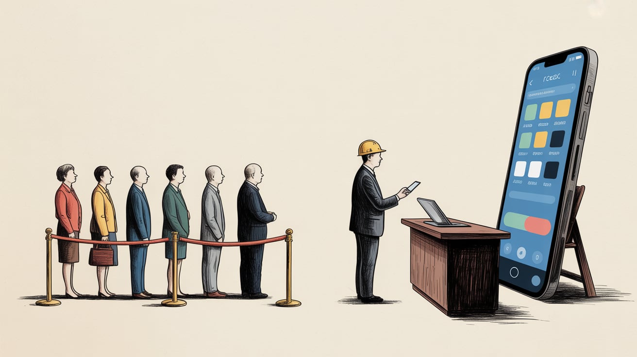
Slava Polonski, a UX researcher at Google, published field notes from studying Dubai’s most aggressively luxurious hospitality environments — and the framework he extracts is a quiet indictment of how most digital teams think about experience design. The insight: physical service design solved ‘seamless experience’ decades before the tech industry coined the phrase, and we’ve barely stolen any of its methods.
The Service Blueprint Your App Is Missing
Hospitality designers have long used a tool called the service blueprint — a rigorous map of every customer touchpoint, the backstage operations supporting it, and the failure points in between. It separates what the guest sees from what the staff does to make that moment possible.
Digital teams rarely build anything equivalent. We have user journey maps, sure, but they typically stop at the interface. They don’t model the data pipeline feeding a personalisation engine, the CMS workflow that keeps content fresh, or the three-step internal approval process that means a broken banner stays live for six days.
For brands operating across Southeast Asia’s fragmented digital landscape — managing separate storefronts on Shopee and Lazada, a LINE OA, a mobile app, and a web experience — the gap between what customers experience and what teams can actually see is enormous. A service blueprint forces that gap into view. The conversion drop-off your dashboard flags is usually a symptom; the blueprint shows you the cause.
Sensation Before Information
Polonski’s hotel observation that resonates most sharply: luxury hospitality prioritises sensation before information. The scent in the lobby, the weight of the key card, the unhurried pace of check-in — these are all communicating ‘you are safe, you are valued’ before a single word is spoken.
Digital design almost always inverts this. We lead with information architecture — menus, categories, search bars — and treat sensation (visual weight, motion, micro-interactions) as decoration applied at the end of the process, if budget permits.
This is partly a resourcing problem and partly a measurement problem. It’s hard to A/B test the emotional register of a loading animation. But the brands that have committed to it — Sea Group’s Garena, for instance, where UI motion and sound design are treated as core product features rather than polish — consistently outperform on retention metrics in ways that straightforward feature comparisons don’t explain.
The lesson for design teams isn’t to add gratuitous animation. It’s to ask, early in the process: what should this feel like before the user reads anything? That question changes what gets prioritised in the design system.
The Human Touch as a Data Architecture Problem
Here’s where my own instincts kick in, because this is fundamentally a pipeline problem dressed as a design problem.
The reason hospitality UX has always felt more human than digital UX is that hotel staff have context. A good concierge knows you’ve been on a 14-hour flight, notices you’re travelling alone, and adjusts the interaction accordingly. That contextual awareness drives the sensation of being seen.
Digital products can replicate this — but only if the underlying data architecture is built to surface that context at the right moment. Most Southeast Asian brands are sitting on rich behavioural data across their platforms that never gets unified into a single customer profile. The Shopee purchase history, the LINE chat transcript, the app session data — they live in separate silos, owned by separate teams, queried by separate analysts who report to separate managers.
The design team then gets handed a brief to ‘make the experience feel more personal’ with no actual signal to personalise against. They add a first-name greeting and call it done.
Building the lakehouse model that unifies these signals isn’t glamorous work. It doesn’t show up in a case study the way a redesigned checkout flow does. But it’s the difference between a digital experience that performs warmth and one that actually earns it. The most sophisticated visual design in the world is a facade if there’s no intelligence behind it.
What Hannah Motzel Brown Gets Right That Most UI Designers Don’t
A slight detour, but a useful one. Artist Hannah Motzel Brown’s mechanical pencil drawings — recently profiled by It’s Nice That — achieve something technically demanding: they render skin, fabric, and shadow with enough specificity that you can almost feel the texture. The detail isn’t decorative. It’s the mechanism through which the emotional weight of the work is delivered.
This is the craft principle that separates competent UI design from exceptional UI design. Specificity is the delivery vehicle for feeling. Vague design — rounded corners, generic sans-serif, stock photography — communicates nothing beyond ‘we are a company with a website.’ Specific design choices, made with intent and executed with precision, communicate brand character before the user consciously registers anything.
For teams building across multilingual, multi-platform Southeast Asian contexts, this specificity has to survive translation — literally. A design system that relies on headline typography to carry emotional weight will fail when that headline is in Thai or Bahasa Indonesia and the line breaks differently. The sensation has to be encoded in elements that are language-agnostic: spacing, colour weight, motion timing, imagery style.
That’s not a small constraint. It’s a useful forcing function to build design systems that are genuinely robust rather than English-first with localisation bolted on.
Key Takeaways
- Map every digital touchpoint against a full service blueprint — including the backstage operations — to surface friction that user journey maps and analytics alone will never reveal.
- Prioritise sensation before information architecture: define how an experience should feel before finalising what it needs to say, and encode that feeling in language-agnostic design elements.
- Treat customer data unification as a prerequisite for personalisation, not a future roadmap item — the human touch in digital UX is only possible when context is actually available at the interface layer.
The hospitality industry spent a century perfecting the science of making people feel known. Digital product teams have had maybe fifteen years, and we’ve spent most of them optimising for click-through rates. The more interesting question isn’t how to make our apps look more like hotels — it’s whether our organisations are structured to do the backstage work that genuine warmth actually requires.
At grzzly, we work with growth teams across Southeast Asia on exactly this challenge — connecting the data infrastructure and design systems that need to work in concert for digital experiences to feel genuinely human, not just visually polished. If your team is navigating that gap between what your dashboards show and what your customers actually feel, we’d like to think through it with you. Let’s talk
Sources

Written by
Chunky GrizzlyDesigning the foundational plumbing — data warehouses, lakehouse models, and ETL pipelines — that separates organisations with genuine intelligence from those drowning in dashboards.