
Behavioral economics reveals why users ignore logical interfaces. Use these frameworks to reduce friction and design UX that drives real action across SEA markets.
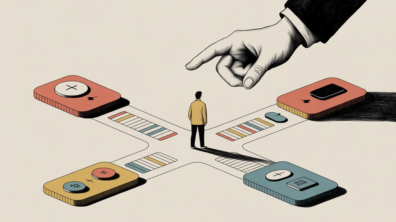
Your checkout flow converts at 2.3%. You’ve A/B tested button colours, tightened the copy, moved the CTA above the fold. It still converts at 2.3%. The problem probably isn’t the interface — it’s that you’re designing for rational users who don’t exist.
Nielsen Norman Group’s Sarah Thompson makes the case plainly: behavioral economics gives UX teams a structured way to find the hidden friction that usability audits miss. Not the friction users complain about, but the cognitive friction they can’t articulate because it operates below conscious decision-making. For marketing teams in Southeast Asia running high-traffic commerce experiences on Shopee, Lazada, or their own apps, this isn’t academic. A 1-point conversion lift at scale is the difference between a campaign that paid for itself and one that didn’t.
The Gap Between Intent and Action Is Your Actual Design Problem
Behavioral economics distinguishes between what users intend to do and what they actually do when placed inside a system. The gap between those two states is where most UX investment is wasted. Classic frameworks like loss aversion, choice overload, and default bias explain why a 12-option product filter kills conversions even when every option is relevant, or why a pre-ticked subscription checkbox outperforms an opt-in one by a factor most brand managers find uncomfortable to admit.
Thompson’s framework maps these biases to specific interface moments: onboarding flows where cognitive load spikes, purchase paths where uncertainty triggers abandonment, and notification systems where frequency erodes trust. The strategic implication is that you need a behavioral audit before a design sprint, not after. Identify which bias is causing the drop-off, then design the intervention. Running it the other way — designing first, rationalising the psychology later — is expensive guesswork dressed up as UX process.
Your Design Files Are Also Behavioral Data Infrastructure
Here’s where it gets structurally interesting, and where my own bias toward data architecture sharpens the picture. Adrian Levy’s observation in UX Collective — that digital files increasingly function as substrate for AI and behavioral systems, not just static assets — has a direct implication for UX teams: your Figma components, your interaction annotations, your recorded user sessions are no longer just design artefacts. They’re training inputs.
Organisations that treat their UX research and behavioral data as structured, queryable infrastructure will build compounding advantages. A team that logs behavioral friction points systematically — tagged by bias type, user segment, platform, and outcome — can eventually model which cognitive patterns appear in which audience cohorts. For Southeast Asian brands managing multilingual interfaces across Thai, Bahasa, Vietnamese, and English, where cultural decision-making norms genuinely differ, this kind of structured behavioral data becomes a strategic asset. The teams still treating UX research as a folder of PDF reports are leaving signal on the table.
Platform-Specific Friction Has a Southeast Asian Flavour
Generic behavioral economics frameworks need localisation to be operationally useful in this region. A few specifics worth building into your UX practice:
Social proof operates differently. In markets with strong community-referral purchase behaviour — Indonesia and the Philippines especially — user review counts carry more weight than star ratings. Lazada’s UI surfaces review volume prominently for this reason. If your product pages are leading with aggregate scores rather than review quantity, you’re optimising for the wrong signal.
Scarcity cues have trust debt. Years of aggressive flash-sale mechanics on regional e-commerce platforms have made Southeast Asian mobile shoppers more skeptical of countdown timers than their counterparts in Europe. Overusing urgency triggers erodes credibility faster here. The behavioral intervention is real scarcity transparency — showing actual inventory levels rather than manufactured countdowns — which Shopee has tested with measurable uplift in repeat purchase intent.
Cognitive load scales with screen size, and screens are small. With mobile accounting for the dominant share of commerce traffic across the region, choice overload is not a theoretical concern — it’s a grid layout decision. Research consistently shows that reducing visible options at the category level, even when total inventory is unchanged, lifts add-to-cart rates on sub-6-inch screens. Your desktop and app experiences should not be the same information architecture.
Build the Behavioral Audit Into Sprint Zero
The practical implementation question is where this fits in your process. The answer is earlier than feels comfortable. Before wireframes, before component decisions, before you open a design tool — map the behavioral economics of the specific journey you’re redesigning. Identify three to five bias types likely to be active at each decision point. Document the current interface’s implicit assumption about user rationality, then stress-test that assumption against the bias framework.
This doesn’t require a dedicated behavioral economist on staff. It requires a team that’s read Thompson’s NNG framework, has access to session recording data, and is disciplined enough to hold a 90-minute bias-mapping session before the first sketch. The output is a friction hypothesis document — a single-page artefact that names the cognitive barriers and proposes design interventions ranked by implementation effort versus expected lift. That document becomes the brief for the design sprint, not a retrospective justification for decisions already made.
For teams managing design systems at scale — serving multiple markets, multiple languages, multiple platforms simultaneously — embedding behavioral checkpoints at the component level is the next evolution. Not just accessibility annotations, but behavioral annotations: which bias does this component risk triggering, and what’s the mitigation?
The question worth sitting with: if your design process doesn’t currently account for the gap between user intent and user behaviour, which of your current metrics are measuring the interface you built rather than the experience your users are actually having?
Sources

Written by
Chunky GrizzlyDesigning the foundational plumbing — data warehouses, lakehouse models, and ETL pipelines — that separates organisations with genuine intelligence from those drowning in dashboards.